The current correlation of the six month run shows the offset of the US Treasurys to SP500 will not be effective so the UST weight is 0%. (See the Origin Process yield curve analysis.) The only sector that the US Treasury prvides portfolio offset towards is finance (XLF).
The SP500 sectors in the short 6 month time frame shows the market rally since the election has much of the return from the XTF (finance) ETF sector and since the XLF is the mainstay, still, of this rally, active management is still not that additive.
Since US Treasurys are “blown” and still too rich to provide a hedge or potential offset to a business cycle downturn, the ability to take equity risk is reduced. The market is very speculative and 88% of the portfolio is cash with 5% in finance and 5% industrials.
What follows is an analysis of the graphing of the efficient frontier, the optimized weights for the allowed assets, and an anlysis of volatility and the overall analysis of the correlation between US Treasurys and the SP500.


Using the correlation and the volatility of the assets, a frontier of the most optimal portfolios are mapped for 6 months, 1 year, 3 year and 5 years.
Currently the portfolio optimized for 6 months of data is “swamped” by finance (XLF) with little outward bowing of the frontier to the left. If excellent timing was not applied since the election, this rally would not have resulted with good risk adjusted returns. And since the absence of US Treasury negative correlation which reduces risk taking, and since only 2 sectors are showing in the histograms below, the market is too speculative to justify the equity bets.
The vertical formation of 6 months, 1 year, and 2 year frontiers indicate that if the right sector (XLF) was not weighted, subpar returns would have resulted. Active management is not valued added. The market is speculative and the portfolio has maximum cash weights.

The one year efficient frontier graph with little curvature shows the market is speculative and justifies a large cash weight. However the flat vertical is starting to slope to the right and a curve is starting to form on the higher return sectors.
There are now more sectors providing return than the one sector contribution of finance in the 6 month graph.
The model will be run daily and the cash position will be reduced when a “normal” outward bowing curve appears, likely first appearing in the the 6 month graph.

The two years of data is vertical with large negative return in US Treasurys (TLT), as with the one year of data above. Correlation in rolling 40 day over time graph shows the often positive correlation between US Treasurys and equity which means that not only is the return of US Treasury with negative correlation.not providing an offset to equity with an offset. Energy (XLE) has not provided return over time, nor has a negative correlation that provides offset, only additional correlated risk.

The 3 years frontier graph shows the normal efficient frontier shape bowing out allowing return to be maintained yet risk greatly reduced by weighting low correlated sectors.
As the two years and less frontier graphs are in this 3 year graph, by definition shape, then the weights of assets that are the optimization solution when cash weight is reduced will likely be close to the three years histogram ow portfolio weights, provided below.

The five years frontier graph of affirms the above view of the three year graph and shows outwardly curved efficient frontier which shows in the long run active management greatly reduced risk and realized good return. When this outwardly bowed shape appears for the six month graph, that will be the signal to resume active management and reduce or eliminate cash weights.

The ten year data provides a long term context for risk management and the potential return and risk.This is shown in the backtest below.

Histograms of the above time periods show the weights for the least risk solution portfolio and the risky solution of the tangent line portfolio.
The first set on 6 months of data shows what sectors are driving the vertical frontier graph given above - finance and tech. And affirms the that the market is very speculative.
6 Months data histogram of weights for the optimized portfolio:

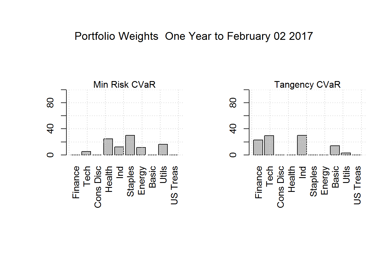
One year of data histogram of weights for the optimized portfolio:
Two years of data histogram of weights for the optimized portfolio:

Three years time span, staples sector become a keystone weight and finance and tech become drivers of more return realized with added risk. This suggests that once the level of speculation drops, showing a more outward bowing efficient frontier, the weights likely will be finance, tech and consumer staples.
Three years of data histogram of weights for the optimized portfolio:

Five years of data histogram of weights for the optimized portfolio:

Ten years of data histogram of weights for the optimized portfolio. The importance of consumer staples
as an anchor sector is shown. US Treasurys are added:

The above frontiers and optimal weights provided are put through a backtest for the last ten years. This is not forward looking but is plotted to see if there is a coherent structure to the optimized portfolios over time such that active management is potentially useful.
And good results for active management shows the use of US Treasurys and then reweighting to more optimal equity sector mix can keep pace with the index - the SP500- yet result in about 65% of the index risk (the backtest shows 61% for the last 10 years).
Note that in theorey the main tool of reducing risk is the use of US Treasurys (TLT). Since US Treasurys are relatively the same credit quality as SP500, this explains why investors will accept US Treasurys yields of about 1/2 of SP500 yield. That differential is the price for the US Treasury insurance in for those economic downturns.
The “drawdown” of the theoretical backtested portfolio shows that in theory the model recommeded weights that would have resulted in 50% of the market loss - the index SP500.
The summary of the above in the backtest plot shows the potential for good risk adjusted returns in comparison to the index, the SP500 with the Origin Process active management. Past returns and certainly not backtesting is no indication of future returns realized, they only frame the analysis of the portfolio process.


A theoretical “what if” test where the backtest is applied to only equity and with no US Treasurys.This shows the usefulness of US Treasurys during major index downturns, or recession. A sector dynamic reweights into US Treasurys does reduce risk. However US Treasurys are currently several sigmas rich and as the Fed normalizes rates large downward jumps are occurring. Currently no US Treasurys are used in the portfolio.
The backtest for this two asset portfolio is derived.


Return and correlation is graphed. The offset of US Treasurys is missing as summed up in the rolling 2 months correlation graph. US Treasurys are not providing offset to equity.
The correlation grids are repeated.
This supports the 0% weight of US Treasurys now.


The realized vol for the SP500 is graphed for short dated to long term. The vol shows levels of near historical lows which when combined with the vertical graphs above affirm the max cash weights.


US Treasurys vol is mapped in comparison to SP500 vol. The extraordinary low volatility for both assets classes is shown and that SP500 volatility is two low in relationship to US Treasury vol.

The weights applied:
| Asset | Weights | ||
|---|---|---|---|
| Cash | 88% | ||
| US Treasurys | 0% | ||
| Equity | 12% | ||
| Sectors: | |||
| Tech-XLK | 5% | ||
| Finance-XLF | 2% | ||
| Industrial-XLI | 5% |
Necessary increased risk control comes about with more frequent model runs and more frequent reweights during this unusual speculative phase; reweighting as frequently as twice a day on market open and market close.
Once a normal distribution of risk is shown by a normal outwardly bowing frontier in 6 months, 1 year, and 3 years, the reweighting will be reduced to once a day and then weekly and then likely only monthly or months. If the curve analysis shows the Federal Reserve has normalized the US Trreasury weights will be applied using the optimized weights.
The Indian equity market after opening lower ended the last trading day on a strong note propelled by index heavy weights. The Sensex closed up 64.09 points at 30921.61, while the Nifty ended up 16.80 points at 9520.90.
ReplyDeleteequity cash tips
Best Online Share Trading Tips Provider